In the Netherlands, orange becomes truly visible whenever a major football tournament begins. It appears on shirts, flags, faces, streets, cafés and supermarket displays. The colour belongs to collective watching, anticipation, national recognition and a temporary sense of shared enthusiasm. Not only because orange is visually striking, but because here it is directly connected to recognition and belonging.
That is also why orange is rarely an obvious choice in Dutch interiors. Many people appreciate the warmth and energy of the colour, yet inside the home it can quickly feel very present or recognisable. The associations with football, King’s Day, supporters and national festivity are close to the surface. In Dutch living contexts, orange often asks for more nuance, softness or materiality than colours such as beige, green or blue.

At the same time, my trend books are not developed for the Dutch market alone. For international interiors, home decor and product development, orange can be read much more broadly: as fruit, warmth, earth, ripeness, energy, light or tactility.
That is why it is interesting to look at orange again now. Not as a single trend colour, but as a colour family that is moving through my current and upcoming trend books, each time with a different role, temperature and meaning.
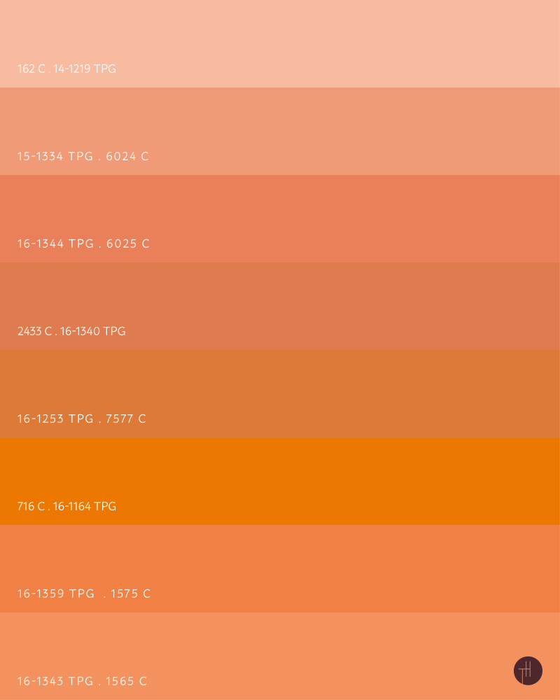
A selection of orange tones from the current and upcoming ATHOME Trend Books.
A family of oranges
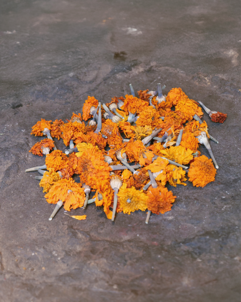
Orange is not one colour. Tangerine, apricot, peach, papaya, salmon, rust, terracotta, clay orange, honey, caramel and baked earth all carry something different. Tangerine feels fresh and juicy. Peach feels soft and skin-like. Papaya adds tropical sweetness. Rust brings depth. Terracotta connects to clay, stone and warmth. Honey and caramel make orange richer and more fluid. Baked earth makes the colour calmer and more material. Within this family, orange shifts from a pronounced colour into a layered colour field.
The temperature of orange
For a colour specialist, the difference is often not in the name of the colour, but in its undertone, saturation and material expression. A clear tangerine orange has a high chroma, meaning strong colour intensity or saturation, and therefore immediately attracts attention. It works as an accent, as a signal or as an energetic counter colour. As soon as orange is mixed with brown, pink, white or grey, the whole emotional temperature changes.
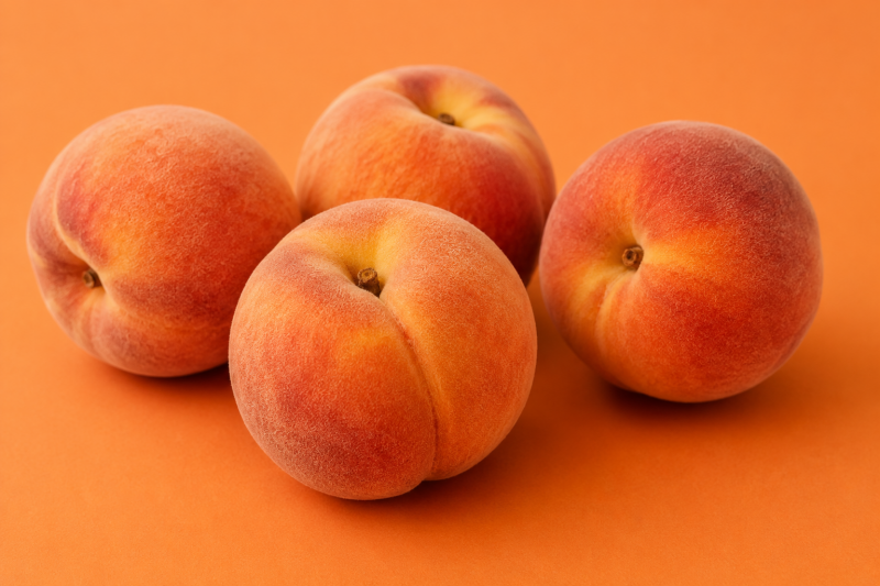
A rust orange gains depth because red and brown make the colour heavier. Terracotta feels more natural because it sits closer to clay, stone and pigment. Peach and apricot become lighter and softer because there is more white, pink or yellow in the colour. Honey and caramel bring a glossier, riper and almost edible feeling into the palette. This shifts orange from bright and graphic towards ripe, warm, tactile or fluid.
Material also determines how orange is read. A glossy orange surface can quickly become powerful and almost synthetic, while the same colour in linen, matt ceramic, raw clay, dyed yarn or powdery paint appears much softer. In interiors, orange is therefore never only a matter of hue. It is about nuance, lightness, saturation, undertone and surface.
Orange through the seasons
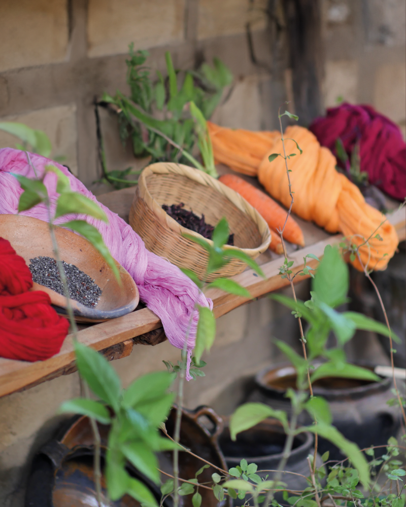
In my Spring Summer 2026 trend book, developed in 2024, orange already appeared in several ways. In Savia, the colour had a harvest feeling, connected to tangerine, fruit, regeneration and material research. An image of orange dyed yarn from Guatemala strengthened that layer: orange was not only a fruity colour there, but also a reference to craft, origin and local colour culture.
In Terra Vestigia, orange moves towards terracotta, baked clay and traces of soil, time and material. It deepens the earthy side of the colour, making orange feel grounded, tactile and almost archaeological.
In Ubuntu, orange takes on a softer and more natural role. The tone appears as a rosy, glowing accent within earth, clay and artisanal structures. It is not loud or dominant, but adds warmth and light to a restrained palette.
Design explorations by Titia Huisman, translating the orange colour family into lighting, ceramics, surface pattern and furniture direction.
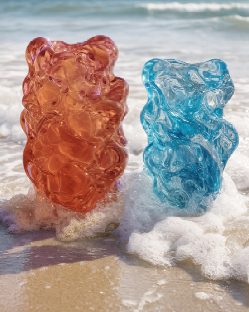
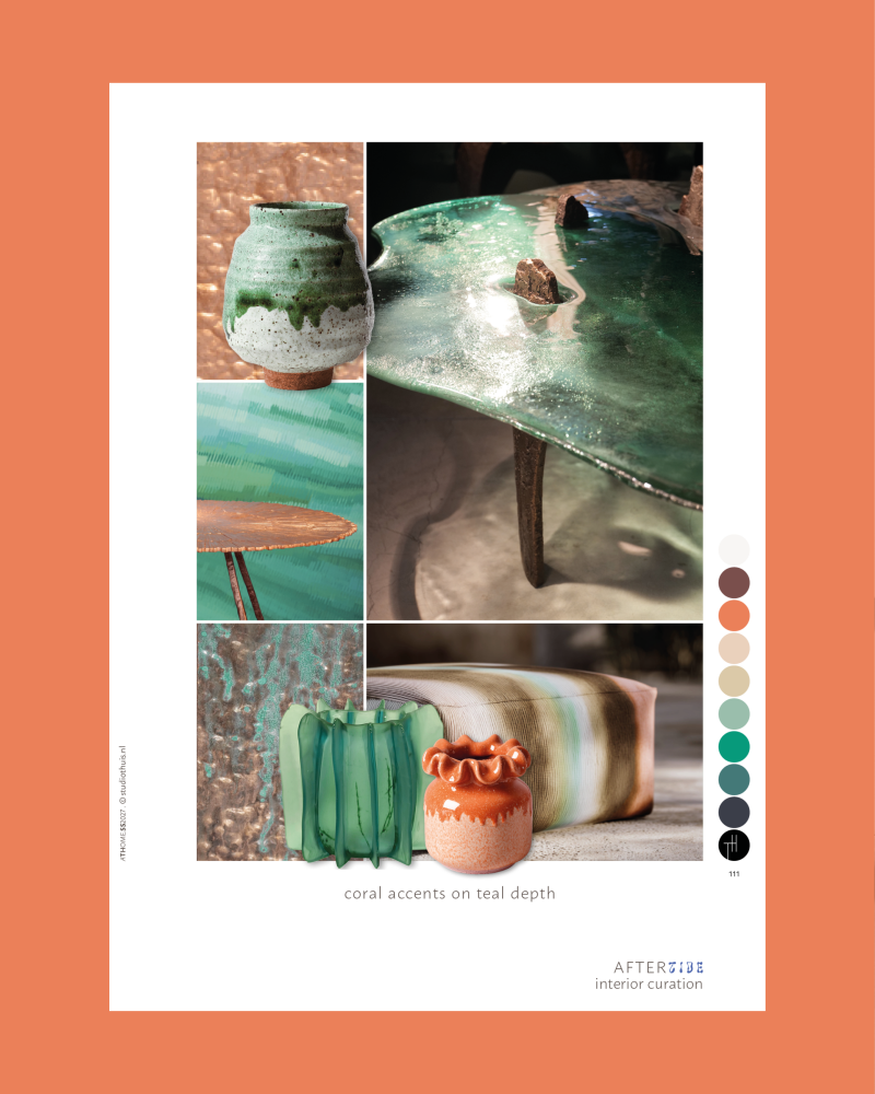
In Avant, orange was used as a warm counter colour against cooler blues and greens. This already revealed a direction that was later developed further in Aftertide: orange not as the main colour, but as tension, movement and temperature difference within a cooler colour story.
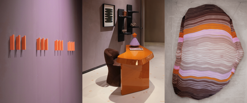
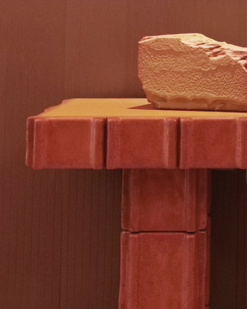
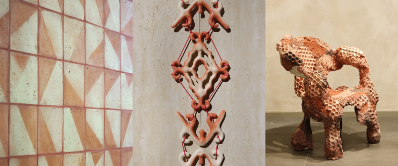
Images from the ATHOME Trend Books Magna Forma theme, showing orange as a bold sculptural accent against lilac, brown and soft neutral tones in interiors, furniture and textile design.
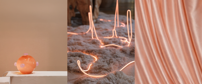
In Spring Summer 2027, this breadth becomes even clearer. In Magna Forma, orange sits alongside red, fuchsia and warm earthy tones, as part of a powerful spectrum of presence and energy. In Natura Kala, orange takes on the role of a signal colour, like a bright flower standing out against deep jungle greens. In Dolce Framenti, it becomes sweeter and softer, moving towards peach, apricot and gelato tones, with an Italian atmosphere of summer light, fruit and soft luxury.
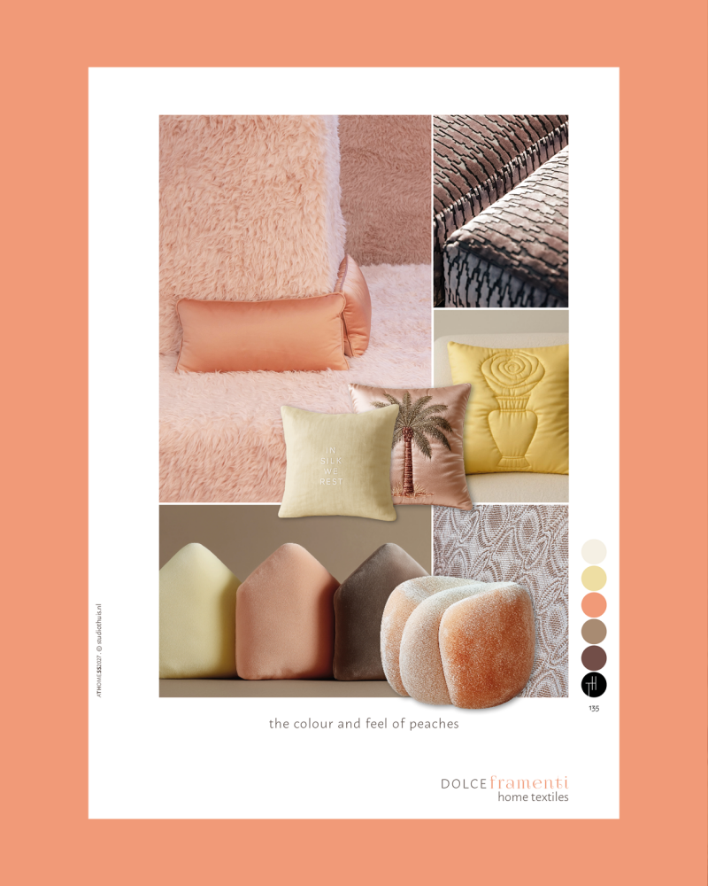
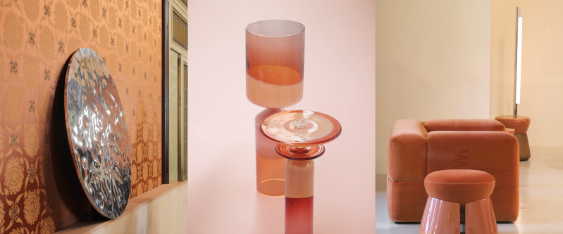
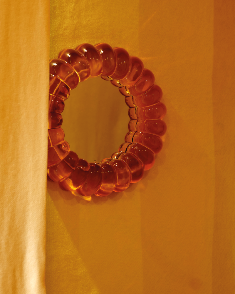
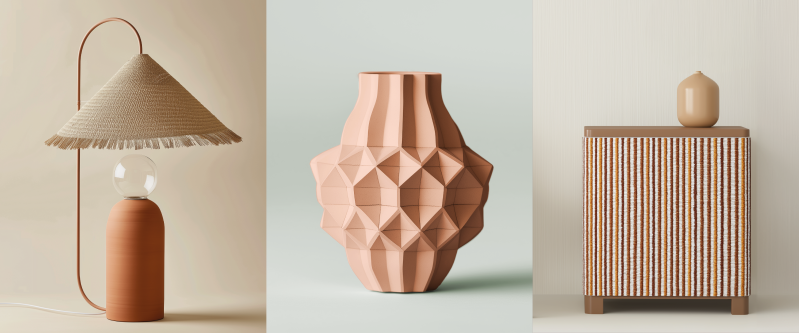
Images from Dolce Frammenti, showing orange in a softer and sweeter direction through peach tones, translucent glass, decorative surfaces and warm interior pieces.
Towards Autumn Winter Christmas 2027 and 2028, orange shifts again. In Terra Halo, the colour gains an almost luminous quality, like a soft aura or glow. In Bonbon Salon, the sweeter line of Dolce Framenti receives a winter and festive translation, with peach, soft shine and decorative warmth. In Nappé Doré, orange becomes richer and more fluid, with honey, caramel and an almost edible warmth.
Images from the ATHOME Trend Books Terra Halo theme, where orange appears as a soft aura of light, translucency and warm material glow.
This shows how versatile orange really is. The colour can open up a cool palette, deepen an earthy base, form a signal against green, bring softness through peach and apricot, or gain warmth and shine through honey and caramel. Orange is therefore not simply a colour that does or does not return. For product development, the more interesting question is: what role does the colour play, which materials is it connected to, and what emotional temperature does it bring into a collection?
From colour field to surface
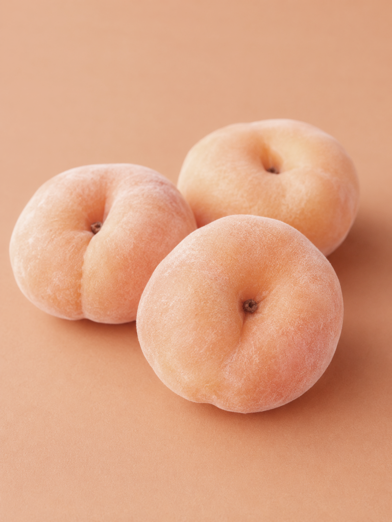
The softer oranges are especially interesting because they connect colour with feeling. Peach, apricot and papaya bring a light sweetness, but not in a flat or childish way. They carry something ripe and tangible. The skin of a peach, the soft bloom on an apricot, the flesh of papaya. There is a quality here that goes beyond colour alone. It is about surface, softness, light and touch.
This connects to a broader movement in interiors and home decor. Colour is less and less treated as a flat field on a colour card. It gains meaning through material, finish and tactility. A peach orange in matt textile feels different from the same shade in glossy ceramic. Terracotta on raw clay works differently from rust on metal. Honey orange in gloss feels different from apricot in powdery paint. Orange becomes interesting when it is connected to skin, fibre, glaze, stone, fruit, pigment and light.
Towards Spring Summer 2028
For the new ATHOME Spring Summer 2028 trend book, currently in development, this colour family takes shape once again. Peach, apricot and papaya bring a light sweetness and a skin-like softness, like the soft bloom on ripe fruit. Rust, terracotta and clay orange bring grounding, depth and material feeling. Honey and caramel add warmth, shine and an almost fluid ripeness. In this way, orange becomes more than a separate colour accent. It becomes part of a broader story about surface, tactility and warmth.
The shift is not in the simple conclusion that orange is back. Orange was already there, but the colour is now being read in a richer way. It moves away from only national recognition and temporary

ATHOME Spring Summer 2028 is currently in development and will be released in September 2026.
Would you like to be notified when the new trend book is available? Leave your email address below and receive a message as soon as the book is released.
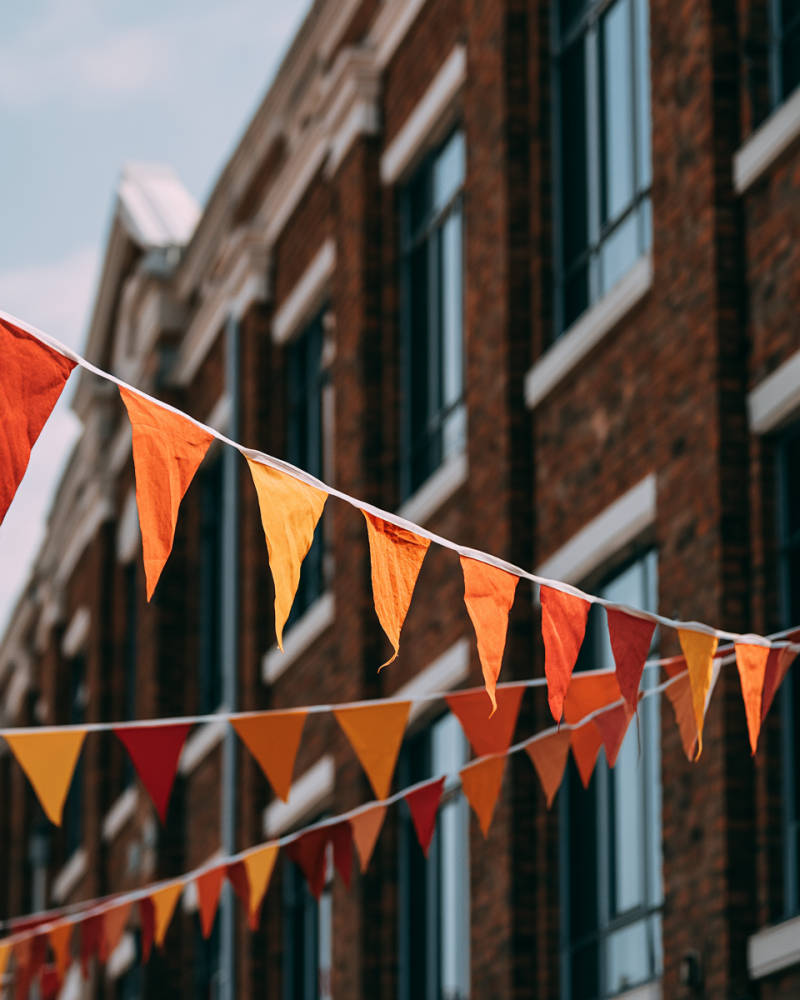
In Nederland wordt oranje pas echt zichtbaar zodra een groot voetbaltoernooi begint. Dan verschijnt de kleur op shirts, vlaggen, gezichten, straten, cafés en supermarktschappen. Ze hoort bij samen kijken, spanning, nationale herkenning en tijdelijk gedeeld enthousiasme. Niet alleen omdat oranje opvallend is, maar omdat de kleur hier direct verbonden is met een gevoel van herkenning en saamhorigheid.
Juist daardoor is oranje in het Nederlandse interieur zelden een vanzelfsprekende keuze. Veel mensen waarderen de warmte en energie van de kleur, maar vinden haar in huis snel heel aanwezig of herkenbaar. De associaties met voetbal, Koningsdag, supporters en nationale feestelijkheid liggen dicht aan de oppervlakte. Daardoor vraagt oranje in Nederlandse wooncontexten vaak om meer nuance, verzachting of materiaalgevoel dan bijvoorbeeld beige, groen of blauw.
Tegelijkertijd worden mijn trendboeken niet alleen voor de Nederlandse markt ontwikkeld. Binnen internationale interieurs, home decor en productontwikkeling kan oranje veel breder worden gelezen: als fruit, warmte, aarde, rijping, energie, licht of tactiliteit.
Juist daarom is het interessant om nu opnieuw naar oranje te kijken. Niet als één trendkleur, maar als een kleurfamilie die door mijn huidige en komende trendboeken heen beweegt, telkens met een andere rol, temperatuur en betekenis.
Een familie van oranjes
Oranje is niet één kleur. Sinaasappel, abrikoos, perzik, papaya, zalm, roest, terracotta, kleioranje, honing, karamel en gebakken aarde dragen allemaal iets anders. Sinaasappel voelt fris en sappig. Peach voelt zacht en huidachtig. Papaya geeft een tropische zoetheid. Roest brengt diepte. Terracotta verbindt zich met klei, steen en warmte. Honing en karamel maken oranje rijker en vloeibaarder. Gebakken aarde maakt de kleur rustiger en materiëler. Binnen die familie verschuift oranje van een uitgesproken kleur naar een gelaagd kleurgebied.
De temperatuur van oranje
Voor een kleurspecialist zit het verschil vaak niet in de naam van de kleur, maar in de ondertoon, verzadiging en materiaalwerking. Een helder sinaasappeloranje heeft veel chroma, oftewel kleurkracht of verzadiging, en vraagt daardoor direct aandacht. Het werkt als accent, als signaal of als energieke tegenkleur. Zodra oranje wordt gemengd met bruin, roze, wit of grijs, verandert de hele emotionele temperatuur.
Een roestoranje krijgt diepte doordat rood en bruin de kleur verzwaren. Terracotta voelt natuurlijker omdat de kleur dichter bij klei, steen en pigment komt. Peach en abrikoos worden lichter en zachter doordat er meer wit, roze of geel in de kleur zit. Honing en karamel brengen een glanzender, rijper en bijna eetbaar gevoel in het palet. Daardoor verschuift oranje van fel en grafisch naar rijp, warm, tactiel of vloeibaar.
Ook het materiaal bepaalt hoe oranje gelezen wordt. Een glanzend oranje oppervlak kan snel krachtig en bijna synthetisch worden, terwijl dezelfde kleur in linnen, mat keramiek, ruwe klei, geverfd garen of poederige verf veel zachter oogt. Daarom is oranje in interieur nooit alleen een kwestie van tint. Het gaat om nuance, lichtwaarde, verzadiging, ondertoon en oppervlak.
Oranje door de seizoenen heen
In mijn trendboek Spring Summer 2026, ontwikkeld in 2024, verscheen oranje al op verschillende manieren. In Savia had de kleur een harvest gevoel, verbonden met sinaasappel, vrucht, regeneratie en materiaalonderzoek. Een beeld van oranje geverfd garen uit Guatemala versterkte die laag: oranje werd daar niet alleen een fruitige kleur, maar ook een verwijzing naar ambacht, herkomst en lokale kleurcultuur.
In Ubuntu kreeg oranje een zachtere en natuurlijkere rol. De tint werkte als een rozig oplichtend accent binnen aarde, klei en artisanale structuren. Niet luid of dominant, maar als een kleur die warmte en licht toevoegt aan een ingetogen palet. Terra Vestigia verdiept die aardse lijn, met oranje als terracotta, gebakken klei en spoor van bodem, tijd en materiaal.
In Avant werd oranje ingezet als warme tegenkleur tegenover koelere blauwen en groenen. Daarmee werd al een richting zichtbaar die later in Aftertide verder werd uitgewerkt: oranje niet als hoofdkleur, maar als spanning, beweging en temperatuurverschil binnen een koeler kleurverhaal.
In Spring Summer 2027 wordt die breedte nog duidelijker. In Magna Forma staat oranje naast rood, fuchsia en warme aardetinten, als onderdeel van een krachtig spectrum van aanwezigheid en energie. In Natura Kala krijgt oranje de rol van signaalkleur, zoals een felle bloem die zich aftekent tegen het diepe groen van de jungle. In Dolce Framenti wordt het juist zoeter en zachter, richting peach, apricot en gelato tinten, met een Italiaanse sfeer van zomerlicht, fruit en zachte luxe.
Richting Autumn Winter Christmas 2027 en 2028 verschuift oranje opnieuw. In Terra Halo krijgt de kleur een bijna lichtgevende kwaliteit, als een zachte aura of gloed. In Bonbon Salon krijgt de zoetere lijn van Dolce Framenti een winterse en feestelijke vertaling, met peach, zachte glans en decoratieve warmte. In Nappé Doré wordt oranje rijker en vloeibaarder, met honing, karamel en een bijna eetbare warmte.
Daarmee wordt zichtbaar hoe veelzijdig oranje eigenlijk is. De kleur kan een koel palet openen, een aardse basis verdiepen, een signaal vormen tegenover groen, zachtheid brengen in peach en abrikoos, of warmte en glans krijgen in honing en karamel. Oranje is dus niet alleen een kleur die wel of niet terugkomt. Voor productontwikkeling is de vraag veel interessanter: welke rol krijgt de kleur, met welke materialen wordt ze verbonden en welke emotionele temperatuur brengt ze in een collectie?
Van kleurvlak naar oppervlak
De zachtere oranjes zijn vooral interessant omdat ze kleur verbinden met gevoel. Peach, abrikoos en papaya brengen een lichte zoetheid, maar niet op een vlakke of kinderlijke manier. Ze hebben iets rijps en tastbaars. De huid van een perzik, de zachte waas op een abrikoos, het vruchtvlees van papaya. Daar zit een kwaliteit in die verder gaat dan kleur alleen. Het gaat om oppervlak, zachtheid, licht en aanraking.
Dat raakt aan een bredere beweging in interieur en home decor. Kleur wordt steeds minder behandeld als een los vlak op een kleurkaart. Ze krijgt betekenis door materiaal, finish en tactiliteit. Een peach oranje in mat textiel voelt anders dan dezelfde tint in glanzend keramiek. Terracotta op ruwe klei werkt anders dan roest op metaal. Honingoranje in glans voelt anders dan abrikoos in poederige verf. Oranje wordt interessant wanneer het gekoppeld wordt aan huid, vezel, glazuur, steen, fruit, pigment en licht.
Richting Spring Summer 2028
Voor het nieuwe ATHOME Spring Summer 2028 trendboek, dat op dit moment wordt ontwikkeld, krijgt deze kleurfamilie opnieuw vorm. Peach, abrikoos en papaya brengen een lichte zoetheid en een huidachtige zachtheid, zoals de zachte waas op rijp fruit. Roest, terracotta en kleioranje zorgen juist voor gronding, diepte en materiaalgevoel. Honing en karamel voegen warmte, glans en een bijna vloeibare rijpheid toe. Daarmee wordt oranje geen los kleuraccent, maar onderdeel van een breder verhaal over oppervlak, tactiliteit en warmte.
De verschuiving zit dus niet in de simpele conclusie dat oranje terug is. Oranje was er al, maar de kleur wordt rijker gelezen. Ze beweegt weg van alleen nationale herkenning en tijdelijke uitbundigheid, en krijgt meer ruimte als zintuiglijke kleur: als warmte, rijpheid, zachte energie, oppervlak en materiaaltaal. Precies daar verschuift oranje van spektakel naar sfeer.
Add comment
Comments