Interior Trend Forecasting & ATHOME Trend Books

Colour, material, print, form and finish direction for interior, home decor and seasonal collection development. Published twice a year for Spring Summer and Autumn Winter Christmas.

TH | STUDIO THUIS

Titia Huisman is a trend forecaster, designer and creator of ATHOME Trend Books.

With over 25 years of experience, she translates signals from design, culture and the market into clear direction for colour, material, print, form, surface and atmosphere.

Her work supports brands, retailers, product developers and design teams in building coherent collections for home decor, interior and seasonal products.

ATHOME Trend Books translate long-term observation of colour, material, print, form and finish into clear direction for future collections.

Created for brands, designers, buyers and product developers, they support home decor and interior product development up to two years ahead.

Published twice a year for Spring | Summer and Autumn  | Winter | Christmas, with a distinctive focus on seasonal and Christmas collections.


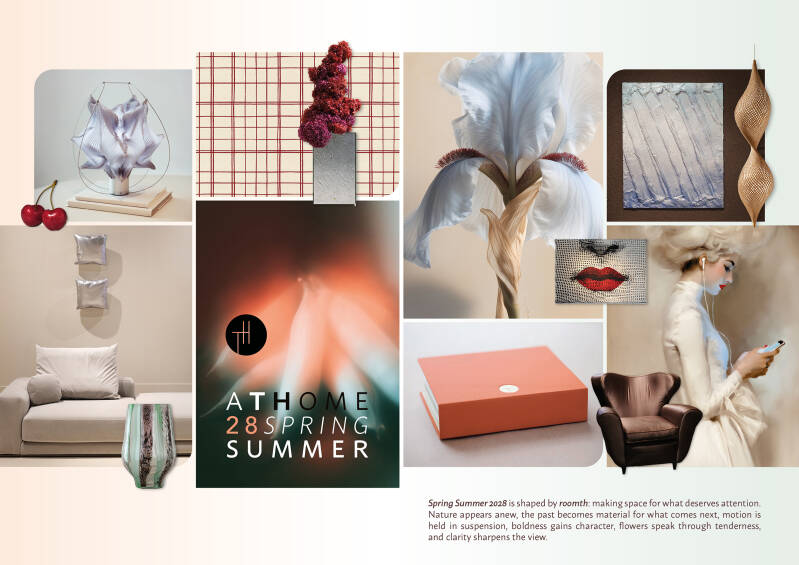
LATEST EDITION: ATHOME Spring Summer 2028 is now available

Explore six design directions for interior and home decor collections. Unexpected colour combinations, inflated forms and objects designed for shared moments open up new possibilities for product development.

Original Pantone TPG colour samples, physical material swatches and royalty-free patterns help translate these ideas into your own collection.

ATHOME Autumn Winter Christmas 2027/2028

Discover seven design directions for autumn, winter and Christmas collections. Colour, tactile materials, decorative details and festive settings offer starting points for home accessories and seasonal decoration.

Original Pantone TPG colour samples and royalty-free patterns support the development of coordinated collections.

TH UPDATES

Receive occasional updates from Titia Huisman and ATHOME Trend Books, including previews, new releases, Milan reports and notes on colour, material, surface and interior direction.

TH At Home Interior Trend Books

An antenna for colour material and future direction.
Receiving signals. Translating direction.

THE JOURNAL

Notes on colour, material, surface, design fairs and time signals for future interiors and home decor.


ROOMTH

Sometimes a nearly forgotten word is exactly what is needed to understand something of the present. ROOMTH once meant room, place and spaciousness. Today, it can describe something that appears to be becoming increasingly scarce: the ability to give one thing our full attention. It is not only about the physical space around us, but also about the space we consciously make for something. For concentration, an experience, a thought, an object or another person.

Read more »

What is it?

My archive now contains almost 10,000 photographs from the design weeks in Milan and Copenhagen. Often, I know exactly why I capture something: a colour, material, surface or form. But sometimes I return to an image and wonder: what exactly did I photograph?

Read more »

How Orange Moves from Spectacle to Atmosphere

In the Netherlands, orange becomes truly visible whenever a major football tournament begins. It appears on shirts, flags, faces, streets, cafés and supermarket displays. The colour belongs to collective watching, anticipation, national recognition and a temporary sense of shared enthusiasm. Not only because orange is visually striking, but because here it is directly connected to recognition and belonging.

Read more »

From staging to presence

Products are no longer presented only against a beautiful or neutral background. They are increasingly placed within environments that make something felt: origin, handwork, ritual, history or material awareness.

Read more »

The space between

During Milan Design Week 2026, several installations stood out for what they did not fill. The object itself was no longer always the centre of attention. Instead, the space around it became active. Atmosphere, silence, distance and emotional presence became almost tangible.

Read more »

A Sensory Milan Design Week 2026

In an increasingly fast-moving digital visual culture, design is shifting towards the sensory. Images are everywhere. Interiors, objects and atmospheres are constantly being shared, saved, generated and recombined. AI is making it easier than ever to create perfect visual worlds. Precisely because of this, the need for physical conviction is growing.

Read more »

Milan 2026 Note Eight: A Dutch Line Through Milan

Tijdens het voorbereiden van Milan Design Week 2026 valt op dat de Nederlandse aanwezigheid zich niet op één plek concentreert, maar zich over verschillende lagen verspreidt. Er is een duidelijk collectief ankerpunt, er zijn grote Nederlandse merken met een eigen podium, en daarnaast duiken Nederlandse ontwerpers op binnen internationale samenwerkingen, stadspresentaties en beurscontexten. Juist die spreiding maakt de Nederlandse lijn interessant. Ze laat zien dat Nederlands design in Milaan niet alleen zichtbaar is, maar ook op meerdere manieren meepraat.

Read more »

Milan 2026 Note Six: Capsule Plaza

Capsule Plaza returns to Milan Design Week 2026 with a new main venue at Via Achille Maiocchi 8, directly opposite Spazio Maiocchi. This year, the project gains not only a new address, but also a setting that immediately adds tension and character. The building was once an industrial space and was later transformed into a gym and swimming pool. That layered past gives this edition an especially intriguing backdrop.

Read more »