Magna Forma
ATHOME Spring Summer 2027 | interior trends
Scale is changing its meaning. Where monumentality once created distance, it now moves closer. Not smaller, not less present, but different in how it reveals itself.

Across contemporary presentations and exhibitions, a clear shift becomes visible. The need to be seen has intensified. In a world where everything happens at once, the risk is no longer absence, but disappearance within the mass. What emerges is a desire to claim a moment. To create presence that holds attention.

This is reflected in the use of colour. Red no longer appears as an accent, but as a field. It defines space, captures the eye and keeps it there. There is something almost theatrical in its presence, as if a space or object consciously steps forward.
Fuchsia moves alongside it and subtly alters the tone. It reduces the sharpness without weakening the impact. The result is a richer, more layered expression that does not only attract attention, but sustains it.
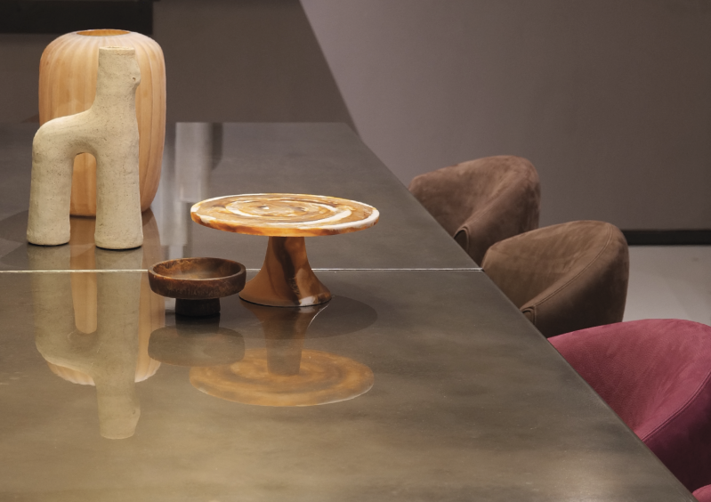
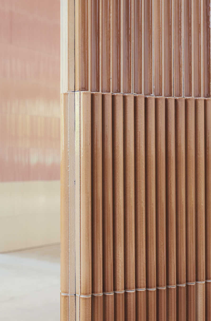
At the same time, a counterbalance becomes essential. Warm earth tones such as maroon, caramel and clay introduce weight and stability. They prevent the composition from becoming fleeting. They ensure that what stands out is also grounded.

At the same time, a counterbalance becomes essential. Warm earth tones such as maroon, caramel and clay introduce weight and stability. They prevent the composition from becoming fleeting. They ensure that what stands out is also grounded.
This balance defines Magna Forma. It is not only about being seen, but about remaining. Not only about impact, but about structure.
The same tension appears in the forms. Volumes are large and clearly present, yet less rigid. Edges are softened, shapes feel more contained and resolved. They hold their position without becoming distant.
For product development, this marks an important shift. Objects gain volume and mass, but also tactility. They invite touch while maintaining their presence.
Materials reinforce this direction. Glazed ceramics reflect light with depth, stone carries weight without feeling harsh, metals appear warmer and less industrial. Textiles are not decorative additions, but integral elements that bring balance.


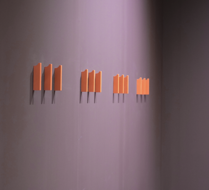

Surfaces move away from strict perfection. Repetition, variation and visible making introduce rhythm and character. The process remains perceptible.
Within ATHOME Spring Summer 2027, this movement is translated into Magna Forma. A direction in which scale is not only about impact, but about balance. About combining visibility with grounding.
Not only standing in the light,
but also understanding where you stand.


Explore the full ATHOME SS 2027 trend book and step into a world where colour, form and material shape what comes next.
Magna Forma
ATHOME Voorjaar Zomer 2027 | interieur trends
Grootte verandert van betekenis. Waar monumentaliteit ooit afstand creëerde, ontstaat nu een vorm die juist dichterbij komt. Niet kleiner, niet minder aanwezig, maar anders in hoe het zich toont.
Wat opvalt in hedendaagse presentaties en op beurzen, is hoe sterk de behoefte aan zichtbaarheid is geworden. In een wereld waarin alles tegelijk gebeurt, ontstaat de drang om niet te verdwijnen in de massa, maar om een moment te claimen.
Dat zie je terug in kleurgebruik dat niet langer ondersteunend is, maar leidend. Rood verschijnt niet als detail, maar als geheel. Als een omgeving die aandacht vasthoudt. Het heeft iets theatraals, alsof een ruimte of object bewust het moment naar zich toetrekt.
Fuchsia beweegt daarin mee, maar verandert de toon. Het maakt het minder hard, minder direct, zonder de kracht te verliezen. Het voegt een zekere gelaagdheid toe, waardoor het niet alleen opvalt, maar ook blijft intrigeren.
Tegelijkertijd ontstaat er een duidelijke tegenkracht. Warme aardetinten zoals maroon, caramel en klei brengen rust en richting. Ze zorgen dat het geheel niet vluchtig wordt. Dat het niet alleen draait om het moment, maar ook om wat daarna blijft.
Die balans is essentieel binnen Magna Forma. Het gaat niet alleen om zichtbaar zijn, maar om zichtbaar blijven. Om kracht te combineren met draagkracht.
Diezelfde spanning zie je terug in de vormtaal. Volumes zijn groot en duidelijk aanwezig, maar verliezen hun scherpte. Randen worden afgerond, vormen voelen compacter en meer in zichzelf. Niet om minder op te vallen, maar om steviger te staan.
Voor productontwikkeling is dat een belangrijke verschuiving. Objecten krijgen meer volume, meer massa, maar ook meer tactiliteit. Ze nodigen uit om aangeraakt te worden, zonder hun kracht te verliezen.
Materialen spelen daarin een duidelijke rol. Keramiek met een diepe glans, steen met een zachte afwerking, metalen met een warme uitstraling. Textiel wordt niet licht of decoratief ingezet, maar als volwaardig onderdeel dat balans brengt.
Ook in oppervlakken zie je die ontwikkeling terug. Geen strakke perfectie, maar ritme en gelaagdheid. Herhaling, lichte variatie en zichtbare bewerking geven karakter aan het geheel.
Binnen ATHOME SS2027 wordt deze beweging vertaald naar Magna Forma. Een richting waarin grootsheid niet alleen draait om imponeren, maar om het vinden van balans tussen opvallen en verankeren.
Niet alleen in het licht staan,
maar ook weten waar je staat.
Add comment
Comments