Over the past few years, the darker side of the interior palette has mostly been carried by warmth.
Deep brown, burgundy, oxblood, mahogany, cacao, clay and reddish depth gave interiors their darker layer. Not hard or graphic, but warm, earthy and saturated. Darkness often appeared as comfort, weight and depth.
That is why black now catches my eye again in furniture, decoration and collection presentations.
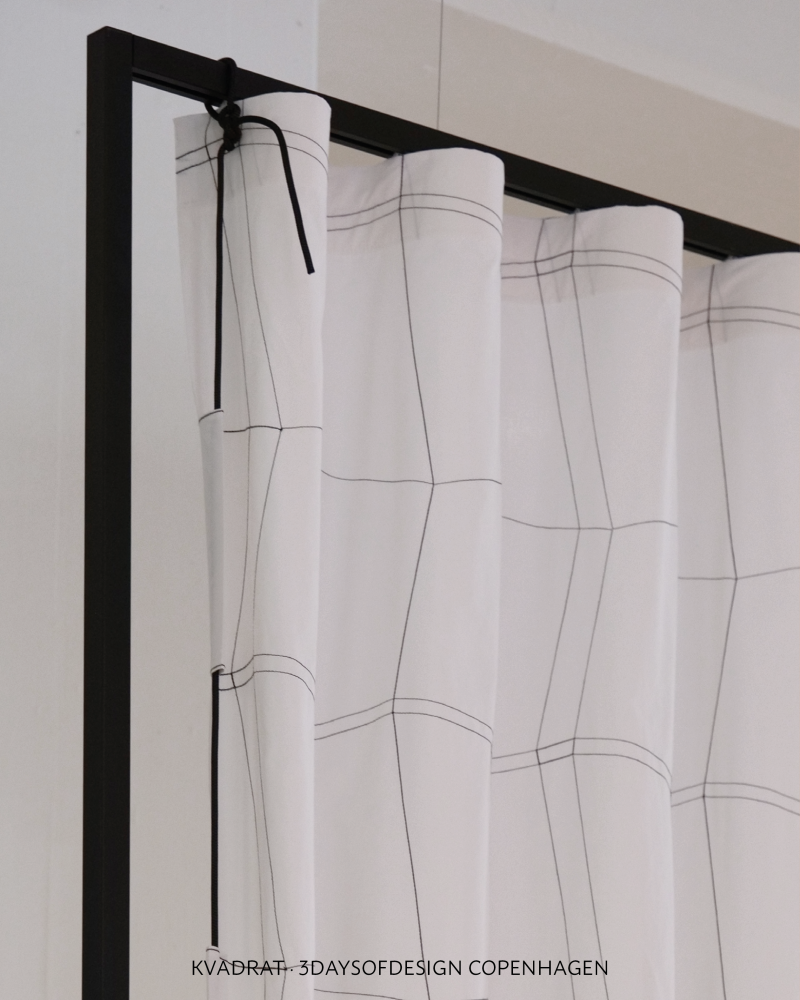
At 3daysofdesign Copenhagen, I noticed many black versions of chairs, tables and furniture. Between fresh, soft and colourful presentations, these black overviews changed the rhythm. They did not compete through colour, but through contour, repetition and silhouette.
With Between Shades from ATHOME Spring Summer 2027, black had already moved into my colour view in a more subtle way. Not as a simple black trend, and not as a hard opposition between black and white. The theme explored the space in between: soft greys, graphite, charcoal, weathered stone, muted yellow, greyed lilac, shadow, light and graphic traces.
This is where a colour signal becomes design direction.
What interests me now is not black as an all-over interior mood, but black as precision. It can sharpen a soft palette, strengthen a form and give an object more presence.
Black sets a point, draws a line and makes the composition more deliberate. Like a contour line in a drawing: not always the subject itself, but what makes form, space and proportion readable.
For interior, home decor and collection development, this matters. Products are developed long before they reach the shop floor. Decisions about colour, material, form and finish are often made one to two years ahead. The question is not only what looks interesting now, but what will still feel relevant by then.
This is the field I work in as an interior trend forecaster: reading early signals and translating them into usable direction for brands, retailers, designers, buying teams and product developers.
Between Shades was part of that forecast. What I see now in current presentations is not a final answer, but a sharper continuation of the same question: how can darkness bring structure, nuance and form into a softer interior palette?
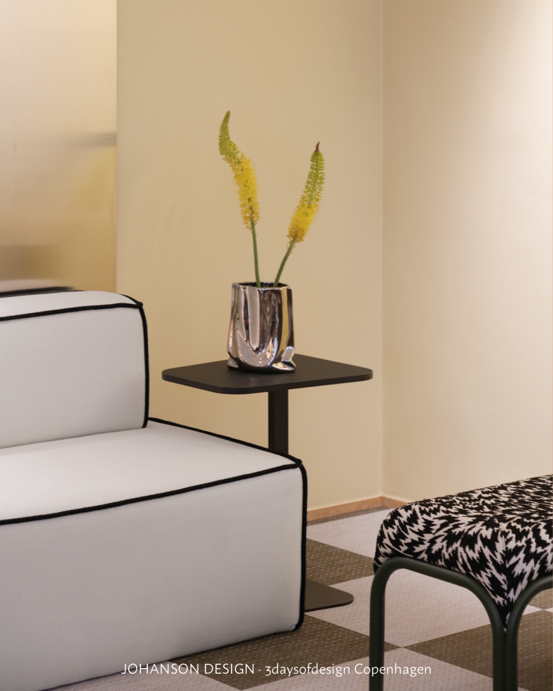

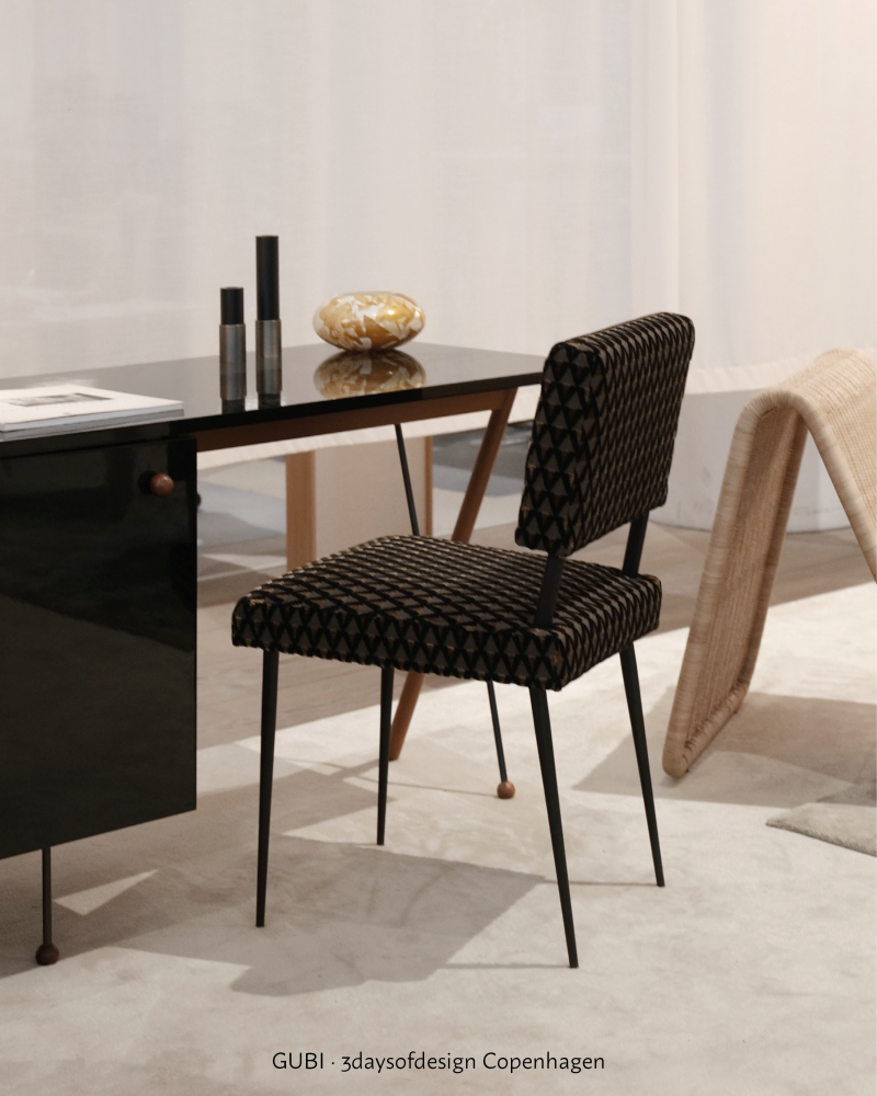


Image references: Between Shades from ATHOME Spring Summer 2027 Trend Book, with observations from 3daysofdesign Copenhagen, including GUBI, Kvadrat, Johanson Design and Muuto.
Explore the full trend book
Between Shades is part of ATHOME Spring Summer 2027 Trend Book, with complete colour palettes, material directions, product inspiration and design signals for interior and home decor.
Add comment
Comments