Interior Trends Autumn Winter Christmas 2027 2028
Key Directions in Colour, Material and Design
Autumn Winter and Christmas 2027–2028 unfolds as a season of depth, tactility and emotional proximity. Rather than focusing on surface or speed, design shifts towards materials that carry time, textures that invite touch and colours that settle into the interior.
This season is not defined by contrast, but by concentration. Forms become softer yet more grounded, materials appear layered or coated, and colour moves away from brightness towards warmth, density and nuance.
Across interiors, a clear direction emerges: a desire for environments that feel composed, sensory and enduring. The festive season plays a key role, shaping how materials, colour and atmosphere come together in the interior.
A season shaped by material awareness
Vision
Design moves closer to the material itself. Surfaces are no longer neutral, but shaped by time, process and use. Coating, layering and preservation replace refinement and perfection.
Research
Across design weeks, a shift emerges towards tactility and density. Glazes, fibres and coatings are explored as part of the design itself, not as surface decoration.
Context
Interiors become more grounded and sensory. Materials bring weight, softness and presence, creating spaces that feel composed and enduring.
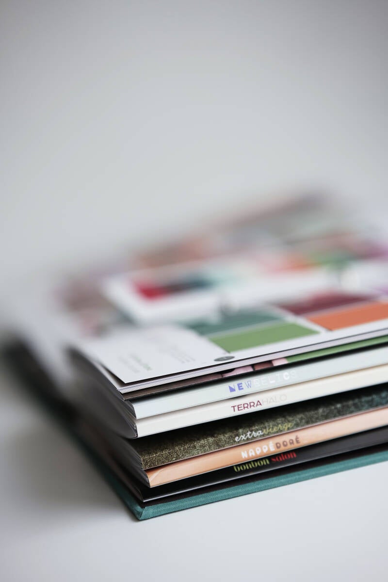
The trend book: seven directions for Autumn Winter 2027–2028
The ATHOME trend book presents seven distinct yet connected themes, each translating this shift into colour, material and form.
Four key directions are highlighted below, offering a focused preview into the season’s most defining movements.


Extra Vierge
A renewed appreciation for origin and material honesty shapes this direction. Surfaces feel as if they have developed over time, layered, preserved and slightly irregular.
Colours move within greens, blues and earthy tones, yet carry an unexpected warmth, as if infused with oil or glaze. Browns and softened oranges create a retro-leaning palette that feels familiar without becoming literal.
Forms are rounded and organic, often built through repetition and subtle variation. Patterns reference nature without direct imitation, appearing as seeds, petals or erosion-like structures.
Materials emphasise continuity. Ceramics, glass and textiles appear coated, sealed or gently aged, giving objects a sense of permanence rather than newness.
Within a Christmas context, this translates into decorations and objects that feel collected over time rather than newly introduced, bringing warmth and familiarity to the festive interior.
Statement
Design shifts from perfection to preservation.
Key direction
Warm greens, glazed surfaces, layered textures, crafted repetition, material continuity
From origin and preservation, the narrative moves towards transformation, where materials are no longer stable, but caught mid-process.
Nappé Doré
Nappé Doré explores the moment where material is still in motion. Surfaces appear melted, thickened or set in transition, as if shaped by heat and time.
The palette is built around caramel, amber and honey tones, enriched with creamy neutrals and deep accents. Colours feel saturated and dense, as if they cling to the surface rather than sit on it.
Forms are fluid and rounded, with visible traces of movement such as drips, bubbles and soft distortions. Texture becomes expressive, capturing the moment between liquid and solid.
Materials translate this process directly. Glass appears molten, ceramics carry thick glazes, and textiles feel soaked or deeply pigmented.
Statement
Material is valued in the moment it transforms.
Key direction
Caramel tones, molten glass, thick glazes, coated textiles, fluid forms


As materials gain weight and richness, the focus shifts from process to experience, where objects become carriers of interaction and attention.


Bonbon Salon
Bonbon Salon reframes luxury as attention. Rather than excess or statement, value lies in detail, gesture and proximity.
The palette combines soft creams, pastels and porcelain tones with accents of lime green, gold and deep brown. Colours are carefully placed, creating contrast without heaviness.
Forms are refined and composed, balancing classic and contemporary elements. Patterns move between dots, jacquards and ornamentation, always controlled and deliberate.
Materials express softness with precision. Quilted textiles, polished ceramics and refined glass create a tactile yet composed environment.
During the festive season, this approach becomes especially visible in table settings and shared spaces, where attention to detail shapes a refined and intimate Christmas experience.
Statement
Luxury is defined by attention, not abundance.
Key direction
Soft pastels, gold accents, refined ornament, quilted textures, curated detail
Where Bonbon Salon focuses on social interaction and detail, the final direction moves inward, towards protection, calm and spatial grounding.


Natural Shield
A quieter but essential layer within the season, Natural Shield introduces protection and softness through material and form.
Colours remain muted and grounded, built around natural neutrals and softened tones. Surfaces feel matte, fibrous and comforting, absorbing light rather than reflecting it.
Forms are simple and enclosing, often rounded or structured to create a sense of shelter. Materials such as wool, wood and raw fibres reinforce this feeling of safety and tactility.
For Christmas interiors, this direction introduces calm and balance, creating spaces that feel soft, protective and quietly composed alongside more expressive festive elements.
Statement
Design creates spaces that protect rather than expose.
Key direction
Muted neutrals, soft fibres, matte textures, enclosing forms, natural materials
These four themes form part of a broader narrative that defines Autumn Winter Christmas 2027–2028. Together, they outline a shift towards interiors that are richer in material, slower in rhythm and stronger in presence.
Explore the complete ATHOME Autumn Winter Christmas 2027–2028 trend book, including all seven themes.